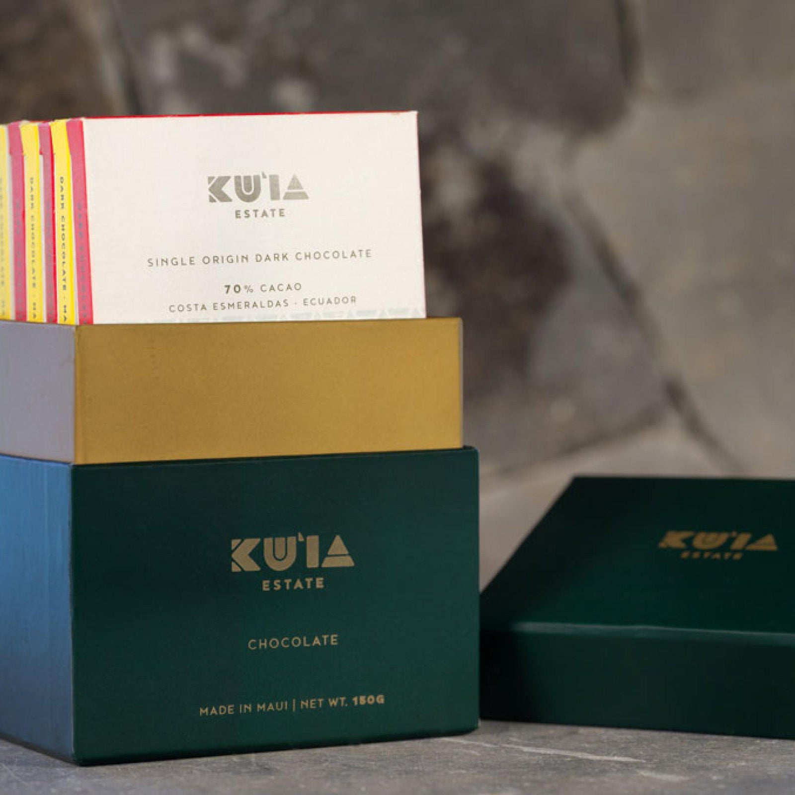
Aloha and welcome back to the blog! This week, we have been chatting with Sae Design’s Zenobia Lakdawalla about the wonderful packaging that she has designed and created for Maui Ku‘ia Estate Chocolate.

“Color-wise, chocolate packaging tends to lean towards light and dark browns,” Zenobia told us. “For Maui Ku‘ia Estate Chocolate I took inspiration from the cacao farm itself and theahupua‘a (traditional Hawaiian land division) of Ku‘ia, where it is located. The dark green is rich in color, traditional yet modern when used with this square box design and it complements the golden lettering and lighter ‘sand’ colors perfectly.”
For customer recognition the Ku
‘ia green boxes will be used for dark chocolate and the Ku
‘ia sand colored boxes will be used for dark milk. We will also be color-coding the flavored chocolate.
We are giving our corporate partners the opportunity to co-brand the packaging for their clients and guests.

“The geometric pattern you see on the lower half of the chocolate boxes takes its inspiration from Hawaiian culture, specifically from the ancient art of making kapa.”

Kapa is a fabric made from beating the inner bark of certain trees until it has been pounded into a fine bark cloth, often imprinted or dyed with geometric designs.
“I had taken a kapa-making class and was intrigued and inspired by the patterns used, so I custom made my own wooden stamp and, during this project, tested it out as a way of giving the packaging authentic Hawaiian design elements.”

We can’t wait to see it in our chocolate factory and retail store in the future. Mahaloto Zenobia for her vision and creativity, we couldn’t be happier!


Leave a comment (all fields required)